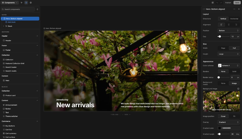
A Components view
Browse sections, blocks, and saved compositions in a Storybook-like surface. Build a hero from existing blocks, save it, preview it, and reuse it later.
Nyxel is an exploration of a simple idea: keep Shopify as the source of truth, keep storefront components in code, and give non-technical teams a visual editor that feels worthy of the theme editor.
The idea has been sitting with me since 2023. I started actively planning it in February 2026 and began building on June 7, 2026. It is still early, but it is being built from years of working around Shopify storefronts.
I spent years around Shopify from different angles: merchant support, Plus, Shogun's page builder and headless products, Liquid theme builds, and now operating a growing ecommerce brand with real B2B and B2C complexity.
Headless can make development faster, but it often makes everyday content work slower. I missed the theme editor: the directness, the mental model, and the way it lets non-developers shape a storefront without waiting on a developer.
Nyxel is inspired by Shopify's theme editor, Weaverse, and Framer. If Shopify ever ships a platform-agnostic theme editor, I will happily cheer it on. Until then, this is my attempt at the best of both worlds.
Browse sections, blocks, and saved compositions in a Storybook-like surface. Build a hero from existing blocks, save it, preview it, and reuse it later.
Small things matter: an Iconify-powered icon picker, richer color and media controls, and schema settings that feel closer to modern app UI than form glue.
The anatomy stays familiar to theme developers: props/settings, markup, local CSS, schema. Svelte adds reactivity without forcing a React-sized mental model.
Shopify theme sections already have a great shape: settings, markup, local styles, and schema. Nyxel keeps that mental model and maps it to Svelte.
{% liquid
  assign align = section.settings.alignment
%}<section class="hero hero--{{ align }}" {{ section.shopify_attributes }}>
{% if section.settings.kicker != blank %}
<p>{{ section.settings.kicker }}</p>
{% endif %}
<h1>{{ section.settings.heading }}</h1>
</section>{% stylesheet %}
.hero { padding: 4rem; }
.hero--bottom { align-items: end; }
{% endstylesheet %}{% schema %}
{ "name": "Hero", "settings": [
{ "type": "text", "id": "heading", "label": "Heading" }
] }
{% endschema %}<script lang="ts">
let { kicker = '', heading = 'New arrivals', alignment = 'bottom' } = $props()
</script><section class="hero" data-align={alignment}>
{#if kicker}
<p>{kicker}</p>
{/if}
<h1>{heading}</h1>
</section><style>
.hero { padding: 4rem; }
.hero[data-align="bottom"] { align-items: end; }
</style><script section lang="json">
{ "name": "Hero", "settings": [
{ "type": "text", "id": "heading", "label": "Heading" }
] }
</script>The docs go deeper into the section schema, setting types, blocks, and saved components. Read the section anatomy guide.
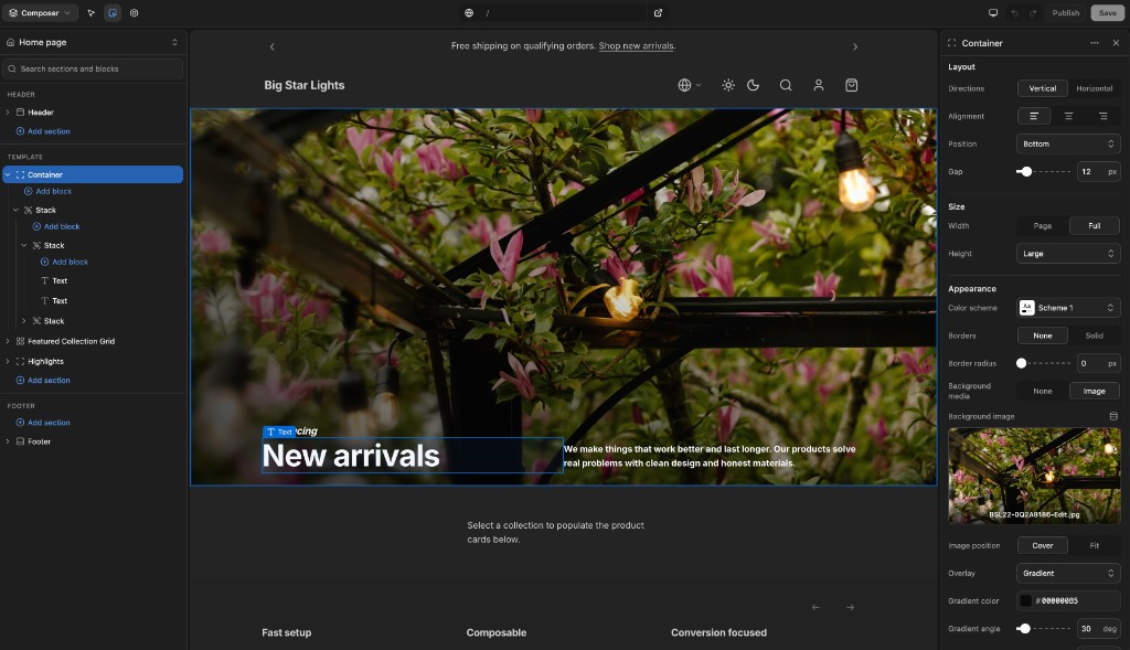
The demo is here to show the authoring model: compose sections, inspect the live preview, bind Shopify data, and save draft changes.