---
title: "Sections"
description: "Section anatomy — the four-block pattern, schema reference, and how sections wire into the editor."
canonical_url: "https://www.nyxel.dev/docs/sections"
markdown_url: "https://www.nyxel.dev/docs/sections.md"
---

# Sections
URL: /docs/sections
LLM index: /llms.txt
Description: Section anatomy — the four-block pattern, schema reference, and how sections wire into the editor.

# Sections

<div class="nyxel-status-callout" data-status="built">
<p><strong>Built</strong> Section anatomy and schema are stable. Individual editor controls still ship incrementally — see the <a href="/docs/editor">Visual Editor</a> settings table.</p>
</div>

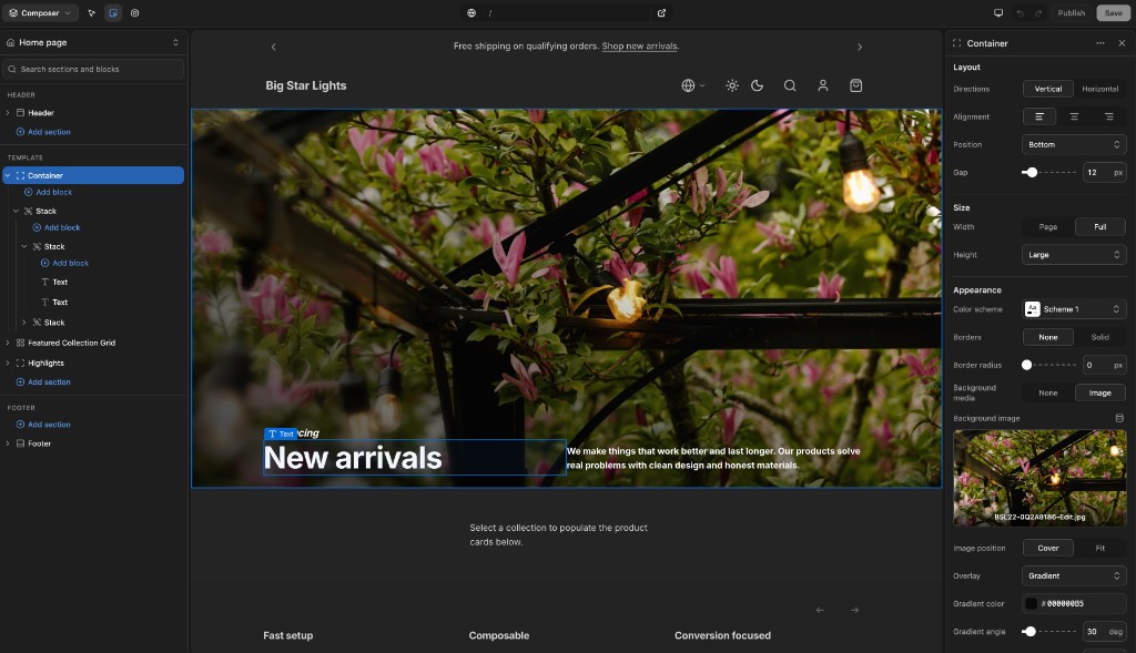
Nyxel sections intentionally borrow from Shopify Liquid theme architecture. A Liquid section is a self-contained unit: Liquid assignments and markup, section-local styles, and a schema block that tells the theme editor which controls to render. Nyxel keeps that shape, but maps it to Svelte.

The goal is not to invent a new authoring model for theme developers. The goal is to preserve the mental model that made Shopify themes approachable, then add Svelte's reactivity, TypeScript, and component ergonomics.

![Composer editing a hero section with the inspector open](/site-media/editor-composer.png)

![Components browser with saved section preview](/site-media/editor-components.png)

## For Liquid developers

If you have built Shopify themes, the mapping should feel immediate:

| Shopify Liquid section | Nyxel Svelte section |
| --- | --- |
| `section.settings.heading` | `let { heading } = $props()` |
| `{% if section.settings.kicker != blank %}` | `{#if kicker}` |
| `{% stylesheet %}` / `{% style %}` | `<style>` in the Svelte component |
| `{% schema %}` | `<script section lang="json">` |
| Blocks use `block.settings` and `block.shopify_attributes` | Blocks are child nodes with typed settings and stable editor ids |

### Liquid section (Shopify theme)

```liquid
{% liquid
  assign align = section.settings.alignment
%}

<section class="hero hero--{{ align }}" {{ section.shopify_attributes }}>
  {% if section.settings.kicker != blank %}
    <p>{{ section.settings.kicker }}</p>
  {% endif %}
  <h1>{{ section.settings.heading }}</h1>
</section>

{% stylesheet %}
  .hero { padding: 4rem; }
  .hero--bottom { align-items: end; }
{% endstylesheet %}

{% schema %}
{
  "name": "Hero",
  "settings": [
    { "type": "text", "id": "heading", "label": "Heading" }
  ]
}
{% endschema %}
```

### Svelte section (Nyxel theme)

```svelte
<script lang="ts">
  let { kicker = '', heading = 'New arrivals', alignment = 'bottom' } = $props()
</script>

<section class="hero" data-align={alignment}>
  {#if kicker}
    <p>{kicker}</p>
  {/if}
  <h1>{heading}</h1>
</section>

<style>
  .hero { padding: 4rem; }
  .hero[data-align="bottom"] { align-items: end; }
</style>

<script section lang="json">
{
  "name": "Hero",
  "settings": [
    { "type": "text", "id": "heading", "label": "Heading" }
  ]
}
</script>
```

The structure stays familiar. The reactivity should feel lighter.

## The four-block pattern

A section is a single `.svelte` file with four blocks in strict order:

```
<script lang="ts">                  props + derived
<section>                           template
<style>                             design tokens
<script section lang="json">        editor schema
```

This is the canonical section anatomy. The `hero.svelte` in the storefront starter is the reference implementation.

## Anatomy

### 1. Script — props and derived state

```svelte
<script lang="ts">
  let {
    heading = 'Welcome',
    subheading = '',
    layout = 'center',
    color_scheme = 'scheme-1'
  }: {
    heading?: string
    subheading?: string
    layout?: 'left' | 'right' | 'center'
    color_scheme?: string
  } = $props()

  const direction = $derived(
    layout === 'left' ? 'row' : layout === 'right' ? 'row-reverse' : 'column'
  )
</script>
```

Every setting `id` in the schema becomes a prop with the same name. Destructured defaults are alphabetical. `$derived` constants read from the props — no mutable `let` state unless you truly need it. This maps directly to how Liquid sections work: schema settings become `{{ section.settings.heading }}`.

### 2. Template

```svelte
<section data-color-scheme={color_scheme} class="hero overflow-hidden">
  <div class="hero-layout flex mx-auto" style="
    max-width: {width === 'full' ? 'none' : 'var(--page-width)'};
    padding-top: {vertical_padding}px;
  ">
    <h1 class="hero-heading">{heading}</h1>

    {#if subheading}
      <p class="hero-subheading">{subheading}</p>
    {/if}
  </div>
</section>
```

Three class layers on every element:

| Layer | Purpose | Example |
|-------|---------|---------|
| **Section classes** | Design tokens (`var(--font-heading-family)`, `var(--spacing-md)`) | `class="hero-heading"` |
| **Tailwind** | Structure (flex, grid, `items-center`, `object-cover`, `max-w-xl`) | `class="flex mx-auto"` |
| **Inline `style=`** | Dynamic prop values (padding, max-width) | `style="padding-top: {n}px"` |

Conditionals use Svelte `{#if}` — familiar to anyone who's written Shopify Liquid (`{% if %}` → `{#if}`).

### 3. Style — design tokens in CSS classes

```css
.hero {
  background-color: var(--color-scheme-background);
  color: var(--color-scheme-text);
}

.hero-heading {
  font-family: var(--font-heading-family);
  font-size: var(--heading-size-xl);
  font-weight: var(--font-heading-weight);
  line-height: var(--line-height-heading);
  letter-spacing: var(--letter-spacing-heading);
  margin-bottom: var(--spacing-md);
}

.hero-subheading {
  color: var(--color-scheme-text-secondary);
  font-size: var(--font-size-lg);

  @media (width >= 640px) {
    font-size: var(--font-size-xl);
  }
}

.hero-cta {
  padding: var(--button-padding-y) var(--button-padding-x);
  border-radius: var(--button-border-radius);
  font-size: var(--button-font-size);
  background-color: var(--color-scheme-button);
  color: var(--color-scheme-button-label);
  transition: background-color var(--transition-fast);

  &:hover {
    background-color: var(--color-scheme-button-hover);
  }
}
```

One class per element (`section-name-element`). Media queries and pseudo-classes nest inside their class block — modern CSS nesting, not SASS. No `@import`. Every section is self-contained.

### 4. Schema — editor settings

```json
{
  "$schema": "./node_modules/@nyxel/sdk/schema/section.schema.json",
  "name": "Hero",
  "category": "Content",
  "type": "section",
  "preview": { "height": 240 },
  "settings": [
    { "type": "header", "id": "content_header", "content": "Content" },
    { "type": "text", "id": "heading", "label": "Heading", "default": "Welcome" },
    { "type": "select", "id": "media_type", "label": "Media type", "default": "image",
      "options": [
        { "value": "image", "label": "Image" },
        { "value": "video", "label": "Video" }
      ]
    },
    { "type": "image_picker", "id": "image", "label": "Image",
      "visible_if": { "setting_id": "media_type", "value": "image" }
    },
    { "type": "video", "id": "video", "label": "Video",
      "visible_if": { "setting_id": "media_type", "value": "video" }
    },
    { "type": "color_scheme", "id": "color_scheme", "label": "Color scheme", "default": "scheme-1",
      "options": [
        { "value": "scheme-1", "label": "Scheme 1" }
      ]
    }
  ]
}
```

This entire block lives inside `&lt;script section lang="json"&gt;…&lt;/script&gt;` at the bottom of the `.svelte` file. The Nyxel preprocessor strips the wrapper before Svelte compilation — only the JSON payload remains. Each `id` maps to a prop. Settings are grouped under `"type": "header"` (Content, Layout, Appearance). Use `visible_if` for conditional visibility.

The `"$schema"` line gives JSON autocomplete and validation in VS Code.

## Setting types

Nyxel mirrors Shopify Liquid's full setting-type catalog.

| Type | Input | Notes |
|------|-------|-------|
| `text` | Single-line text | |
| `textarea` | Multi-line text | |
| `richtext` | Block-level rich text | Shopify rich-text JSON format |
| `inline_richtext` | Inline rich text | No block wrappers |
| `number` | Numeric input | |
| `range` | Slider | `min` / `max` / `step` / `unit` |
| `checkbox` | Boolean toggle | |
| `radio` | Single choice | `options` |
| `select` | Dropdown or segmented | `options` — 2–3 options render as a segmented control |
| `url` | Link | Internal or external |
| `text_alignment` | Left / center / right | Segmented control |
| `color` | Single color | |
| `color_background` | CSS color or gradient | |
| `color_scheme` | Palette reference | Theme-level color schemes; resolves through theme color mode (`light`, `dark`, `system`) with automatic dark mirroring unless a scheme defines `dark` pairing in `settings_data.json` |
| `image_picker` | Image | With dynamic source support |
| `video` | Shopify-hosted video | |
| `video_url` | External video URL | YouTube / Vimeo |
| `product` | Product reference | |
| `product_list` | Product references | `limit` |
| `collection` | Collection reference | |
| `collection_list` | Collection references | `limit` |
| `blog` | Blog reference | |
| `article` | Article reference | |
| `page` | Page reference | |
| `link_list` | Navigation menu | Shopify menus |
| `font_picker` | Font | Curated Nyxel font set |
| `icon` | Iconify icon | `pack` (Iconify prefix) + optional `icons` allowlist; stores `prefix:name` |
| `html` | Custom HTML | Guarded/sanitized block |
| `css` | Custom CSS | Edited with CodeMirror in the editor |
| `metaobject` | Content-model entry | `metaobject_type` |
| `metaobject_list` | Content-model entries | `metaobject_type`, `limit` |
| `header` | Editor-only label | `content` — not data |
| `paragraph` | Editor-only help text | `content` — not data |

## Schema reference

| Field | Type | Description |
|-------|------|-------------|
| `$schema` | string | JSON Schema reference — gives VS Code autocomplete and validation |
| `name` | string | Display name shown in the editor's add-section picker |
| `category` | string | Grouping label in the Components browser and add-section picker (not the Composer Header/Footer regions) |
| `type` | `"section"` \| `"block"` | Top-level section or child block |
| `preview` | object | Editor-only preview hints: `height` (default frame height) |
| `settings` | array | Setting controls shown in the editor sidebar |
| `blocks` | object | Block acceptance rules: `accepted` types, `max_blocks`, `static_slots`, `dynamic_regions` |
| `presets` | array | Named starting configs (settings + blocks) — each a pickable entry in the add menu |

### Component browser categories

The `category` field groups items in the **Theme components** accordion of the Components browser. It is independent of Composer regions (Header / Template / Footer) and of `enabled_on.groups` — those control *where* a section may be added, not how it is filed in the browser.

| Category | Use for |
|----------|---------|
| `Header` | Site shell header section (`Header`) and header blocks (`Announcement bar`, `Announcement`) |
| `Footer` | Site shell footer section (`Footer`) |
| `Product` | Product-detail and purchase-focused components |
| `Collection` | Collection and discovery surfaces (collection lists, featured collection, search pages) |
| `Content` | Storytelling and page-body sections (e.g. `Hero`, `Feature card`) plus text blocks |
| `Commerce` | Cart and checkout utility components that aren't strictly product or collection |
| `Media` | Image/video blocks |
| `Layout` | Structural layout (`stack`, `grid`, `container` section) — hidden from the Components browser |

`buildComponentCatalog()` normalizes legacy labels (for example `Collections` → `Collection`) so older schema files still file into the current groups.

Use `preview.description` when the display name alone is ambiguous (e.g. **Announcement bar** block vs **Announcement** slide block).

### Setting fields

| Field | Description |
|-------|-------------|
| `type` | Setting type (see table above) |
| `id` | Stable identifier — kebab-case, must match a prop name |
| `label` | Human-readable name |
| `default` | Fallback value |
| `info` | Help text shown below the setting |
| `visible_if` | Conditional editor visibility — `{ "setting_id": "other_setting", "value": "some_value" }` shows the control when that setting equals the value |
| `options` | Array of `{ value, label }` for `select` / `radio` / `color_scheme` |
| `placeholder` | Input placeholder text |
| `min` / `max` / `step` / `unit` | Constraints for `range` and `number` |
| `limit` | Max items for list-type settings |
| `pack` | Iconify icon-set prefix for `icon` settings (defaults to `lucide`) |
| `icons` | Optional allowlist of icon names within the pack |

## Container components (accepting blocks)

A section or block that declares `blocks.accepted` is a **container** — the editor offers "Add block" inside it, scoped to the accepted types. The component receives its composed children as a Svelte snippet and decides where they render:

```svelte
<script lang="ts">
  import type { Snippet } from 'svelte'

  let { gap = 12, children }: { gap?: number; children?: Snippet } = $props()
</script>

<div style="display: flex; gap: {gap}px">
  {@render children?.()}
</div>
```

```json
{
  "name": "Stack",
  "type": "block",
  "blocks": { "accepted": { "any": true } }
}
```

Use `"accepted": { "types": ["text", "icon-list"] }` to allow-list specific block types, or `"any": true` to accept everything registered. The reference storefront ships **Container** (top-level section, page/full width, height presets) and **Stack** (block-level flex) — together they enable fully modular page building without new section code.

### Fill height in split layouts

Split-layout sections (hero, container) place block children in a horizontal flex row. Merchants often set layout blocks to **height: Fill** so a content column stretches to match a media column. Nyxel implements this with stretch-aware CSS — not inline `height: 100%`.

See also [Block height: fit, fill, custom](#block-height-fit-fill-custom) for all three block height modes.

#### min-height vs height

Split-layout section shells set **min-height** on the flex row (via a section setting such as hero min height). That gives the row a minimum size without fixing its height. Percentage `height: 100%` on a child resolves against the parent's **definite height**; when the parent only has `min-height`, `100%` collapses to `auto` and columns fail to stretch.

Section rows use `min-height`. Layout blocks that should fill use `min-height: 100%` plus flex stretch — never inline `height: 100%` or `height: N%` for the fill or custom settings.

#### stack and grid height classes

The `stack` and `grid` blocks expose a Height setting with **Fit**, **Fill**, and **Custom**. All three map to shared CSS classes in `layout-block-height.css` (via `$lib/layout/layout-block-height.ts`):

| Setting | Class | Behavior |
|---------|-------|----------|
| Fit | `.layout-block--height-fit` | `height: fit-content` + `align-self: flex-start` — shrink to content |
| Fill | `.layout-block--height-fill` | `align-self: stretch` + `flex: 1 1 auto` — full row cross size |
| Custom | `.layout-block--height-custom` | `min-height: calc(var(--layout-section-min-height) * fraction)` + `align-self: flex-start` |

Custom sets `--layout-block-custom-fraction` (0–1) inline; the section row exposes `--layout-section-min-height`. Do not map fill or custom to inline `style="height: …"` or percentage `min-height` on the block.

See `apps/storefront/src/lib/components/blocks/stack.svelte` and `apps/storefront/src/lib/styles/layout-block-height.css`.

### Block height: fit, fill, custom

**Section height** (hero min height, container height) sets the flex row's **min-height** — svh or px presets that define how tall the split layout is.

**Block height** (`stack`, `grid`) controls how a column participates inside that row:

- **Fit** — column sizes to its content; **default** for `stack` and `grid` (schema default `"fit"`). Use for stacked content that should not stretch.
- **Fill** — column stretches to the row's full cross size via flex stretch; opt in for split-layout content columns (hero, container) when a column must match a media sibling.
- **Custom** — column uses `min-height: calc(var(--layout-section-min-height) * fraction)` (0–100% of the section row min-height); does not stretch like fill.

#### Anti-patterns

| Do not | Do instead |
|--------|------------|
| `style="height: 100%"` for fill | `.layout-block--height-fill` |
| `style="height: {N}%"` for custom | `.layout-block--height-custom` + `--layout-block-custom-fraction` + section `--layout-section-min-height` |
| Fixed `height` on the section flex row | `min-height` on the row (section setting) |
| Block custom height when you mean section height | Raise section min-height; reserve block custom for column share inside the row |

#### Parent stretch checklist

Split-layout sections must cooperate with fill-height blocks:

- [ ] Flex row uses `align-items: stretch` (not `center` unless intentional)
- [ ] Row height is `min-height`, not fixed `height`, unless the design requires it
- [ ] Top-level column selectors bridge the SDK `display: contents` wrapper: `.hero-layout > [data-nyxel-id] > .stack-block` (and matching fallbacks), not only `.hero-layout > .stack-block`
- [ ] Direct columns get `flex: 1 1 50%`, `min-width: 0`, `align-self: stretch`, `min-height: 100%`; sole remaining column uses `flex: 1 1 100%` when a sibling block is hidden/disabled (disabled blocks are not rendered — they leave the flex row entirely)
- [ ] Layout blocks default `height: fit` in schema and presets; set `height: fill` only when a split-layout column must stretch (e.g. hero content beside media)
- [ ] Layout blocks use shared height classes (fill/custom), not inline `height: N%`
- [ ] **Stack Position** (top / center / bottom) is **vertical alignment** of children inside the stack — only visible when block **Height** is **Fill** or **Custom**; fit-height stacks hug content and position has no effect
- [ ] Media inside stretched columns may use `height: 100%` only when the parent column has a definite height via stretch + `min-height: inherit`

Reference: `apps/storefront/src/lib/components/sections/hero.svelte` — stretch rules on `.hero-layout` and child selectors.

### Composition defaults and anti-patterns

Starter-theme templates and presets follow these composition rules:

| Rule | Do | Avoid |
|------|----|-------|
| Block height | Leave `stack` / `grid` at **fit**; set **fill** only in split layouts that need column stretch | Defaulting every stack to fill outside hero-style rows |
| Single-button wrappers | Place `button` blocks as siblings in the parent stack or container section | Wrapper stacks named "Actions" (or similar) that contain only one button |
| Insert presets | Empty `blocks` for stacks and container sections | Demo copy merchants delete on first edit |
| Merchant-specific copy | Bind text to [Dynamic Sources](/docs/dynamic-sources) — e.g. `{ "binding": { "scope": "shop", "path": "name" } }` for shop name, logo alt, footer labels | Hardcoded brand strings (`"Big Star Lights"`, etc.) in committed template JSON |
| Data-bound blocks in Components browser | *(Planned)* Component browser preview will supply placeholder/mock page context for blocks like product-card — see [Visual Editor](/docs/editor) | Expecting catalog preview to render product-bound blocks without mock data today |

### Section groups (header & footer)

A **section group** is an ordered set of sections rendered globally, outside the page body. Groups are templates with `kind: "group"` in `src/lib/templates/` (`header.json`, `footer.json`, and alternates like `footer.summer.json`), loaded in `(theme)/+layout.ts` and rendered with `<Sections container={data.header} />` inside `div#header-group` / `div#footer-group`. The DOM ids are Shopify's section-group wrappers; file keys use `header.*` / `footer.*` so multiple shell groups can coexist and be assigned per route later. Scope sections to groups with `enabled_on.groups` / `disabled_on.groups` so only header-eligible sections appear in the header group editor.

## Scaffolding

Generate a new component with the four-block anatomy in place:

```bash
nyxel generate section featured-collection
nyxel generate block icon-list
```

## Storefront dependencies

Some setting types require packages in your storefront app. The registry compiler detects these at build time and tells the editor which controls are usable:

| Setting type | Storefront package |
|--------------|-------------------|
| `icon` | `@iconify/svelte` |

If a dependency is missing, the editor shows an install notice instead of rendering a broken control. Add entries to `SETTING_TYPE_DEPENDENCIES` in `@nyxel/sdk` when introducing new types that depend on storefront packages.

## Editor control status

Schema types are declared up front; editor controls ship incrementally. See the [Visual Editor](/docs/editor) settings panel table for the current implementation status of each control type.

On save, the Nyxel Vite plugin (registry compiler, shipped from `@nyxel/sdk`):

1. Scans `src/lib/components/sections/` and `src/lib/components/blocks/` for `.svelte` files with `<script section lang="json">` blocks — the subdirectory determines whether each entry is a section or a block
2. Extracts and validates each schema against the Nyxel JSON Schema
3. Generates the **component registry** — a machine-readable manifest of every section and block, its settings, accepted blocks, and presets
4. Publishes the registry as an internal artifact (the `virtual:nyxel-registry` module) the editor consumes

```
Edit section.svelte → Schema regenerates → Registry updates → Editor refreshes → Preview hot-reloads
```

The registry is never hand-maintained. It's the contract between your component code and the visual editor.

### Next steps

- [Agent Skills](/docs/skills) — Nyxel ships a `create-nyxel-component` skill so AI tools author sections and blocks correctly
- [Visual Editor](/docs/editor) — how sections appear in the editor and get composed into pages
- [Dynamic Sources](/docs/dynamic-sources) — bind section fields to Shopify data

## Sitemap

See the full [sitemap](/sitemap.md) for all pages.
Docs-scoped sitemap: [/docs/sitemap.md](/docs/sitemap.md).
Well-known sitemap: [/.well-known/sitemap.md](/.well-known/sitemap.md).
